

Jon Horner by Andy Smoke
What's your art background? Did you study art, design, graphics..?
I've
got an art GCSE! That's it as far as 'formal training' goes though. My
training was years spent copying things from the Beano and trying to
draw the Thunderbirds.
When did you start skateboarding?
Around
2001ish I think. It was in the Tony Hawk boom. My brother skated and it
looked like fun so I got a Hudson complete from JJB Sports for £20. The
board had been shrink wrapped before the trucks were attached, and as I
didn't know how to take the trucks off I spent hours trying to pick all
the little bits of plastic out from around the bolts.

Did one lead to the other?
Not
really, but it definitely helped keep my interest. I'd spend longer
looking at shop adverts than the photos in skate mags. Looking back I
guess it was the tail end of the hand drawn cartoon graphics boom, World
and Blind had been sold but Marc McKee was still doing incredible
drawings for them. Flip had some incredible graphics then too, it
probably helped that most of their team were basically cartoon
characters.

What's your day job?
Mark McKee kind of dropped out not long after that,
what other skateboard graphic artists did you get into? It maybe wasn't
the most obvious era to be inspired by... Did you start getting
interested in older stuff? You seem to have a pretty vast appreciation
of the history of it all.
Enjoi was just starting back
then, I think Marc Johnson was doing the art, there were a lot of Saul
Bass inspired graphic s that were great, the Heroin illustrator series
were always amazing too. As far as particular artists go, at the time I
had no idea who actually did anything! The internet was like a little
broken down hutch compared to the vast rabbit hole it is now so there
wasn't really a way that I knew of to find out who actually did
anything, or really to find old board graphics. Document used to
interview artists, so that was always interesting. I remember trying to
copy one of the drawings in the Jamie Bridson interview.

What's your day job?
I
was hired to design a range of children's characters. Basically, my job
was to invent the characters (how they look, what they're like, their
world etc) and to work with other people on making toys, computer games,
books and that sort of thing. The project is still relatively new, I've
been working on it for about a year now and it's starting to come
together. It's beginning to go from ideas on paper to actual physical
things. Before that I worked at HMV.
Do the people at your work know about your other life as a skateboard illustrator?

How long did the 'Where's...' posters take? I imagine you sitting up for nights on end surrounded by hundreds of magazines - was it like that?

What artists do you rate just now?

Loads of boards get re-issued these days. Do you think that's because the graphics were better then? Rather than just logo boards...
Do the people at your work know about your other life as a skateboard illustrator?
Haha, yeah! The day job's only part time and I work from home so as long as everything gets done it's all good!

'Where's Penny'. Click for bigger and more.
How long did the 'Where's...' posters take? I imagine you sitting up for nights on end surrounded by hundreds of magazines - was it like that?
They
took forever! I don't really want to know exactly how long because it
will probably just make me miserable. There were a few magazines but
mostly it was just finding things online. I watched a lot of old videos
on YouTube and logged an obscene amount of hours scrolling through the
Chrome Ball Incident. That was the fun bit. Mostly they came together
gradually over time but there was one all-nighter. When I did Where's
Chin it was just one massive drawing on 9 sheets of A4 paper held
together with sellotape so the whole thing was pretty precarious. I was
moving flat and I wanted to be able to take it apart before I moved it
so I stayed up all night surrounded by boxes listening to the Tina Fey
audio book (which is excellent) and drawing.
What medium do you work in?
The
most basic one! I plan things in pencil on cheap A4 paper, go over them
with drawing pens, rub out the pencil marks, scan them and colour them
in with MS Paint.

Rejected Factory Sleeve Designs. Click for bigger and more.
What artists do you rate just now?
Andy Smoke, obviously. 'His Board Had No Pop' is one of my favourite things (it's at littleliedown.wordpress.com).
Everything Mike O'Shea does is amazing. There are loads of people! Phil
Morgan, James Jarvis, Ryan Salter, Paul Parker, Pete Fowler, Rob
Mathieson, Mr Gauky... I could probably go on for a while...
Would you be doing what you do now if it wasn't for Gilbert Shelton?
Ha,
I was never that into Shelton, his art is always great though. When I
was younger it was the Beano, Thunderbirds, Asterix and Wallace and
Gromit then the Simpsons and later I discovered underground comics and
got very into R Crumb, Peter Bagge, Joe Matt, Art Spiegelman, Harvey
Kurtzman, guys like that. Basically, anyone who draws properly and
writes funny stories. Life's too short to read turgid crap about
feelings. Although, having said that, Chris Ware is incredible. A bit of
melancholy is fine in his hands.

More Man Cat here.
Loads of boards get re-issued these days. Do you think that's because the graphics were better then? Rather than just logo boards...
Hmm.
Maybe. I don't know if anyone will ever be as good as Sean Cliver, Marc
McKee and Jim Phillips, they were the right guys in the right place at
the right time. And it's true that some companies put out some awful
rubbish these days (and not just logo boards), but there are still
amazing new graphics coming out all the time. I think the reissue market
is a lot more to do with nostalgia, there are a lot of men 'of a
certain age' who have glowing memories of happy childhoods when
skateboarding was all that they cared about. Now they have jobs and
mortgages and responsibilities and reissued boards let them buy back a
little piece of that glow and hang it on their wall. I totally get it, I
bought a copy of the first Beano I ever owned from eBay! Also, it's
probably pretty helpful financially for certain companies who's years of
relevance are in the past.

Magazines have always been a big part of the skateboard aesthetic. You must love magazines.


What I really wanted to do was make comics, so I made one. At the time I was horrendously naive over-ambitious, so I planned out an eleven part epic called 'Gentlemanly Conduct' about a UK skate team on tour in 2002. It was vaguely inspired by the Vans 'No Home Comforts Tour' video, which is one of Andy Evans' many masterpieces. About six months after starting work on it issue one was finished and I sent it out to pretty much every magazine and skateboard company I could think of. Andy got back to me and started giving me bits and bobs to do and it went from there. There was a Big Push DVD cover, some stuff for the Buyer's Guide and the regular strip. The pitch was 'It's like Lost, but with the history of skateboarding'. As I result, I've been making it up as I go along. Getting work from Sidewalk was the first thing that really made me consider illustration as a thing that could potentially be a job, so I started looking for part time work to subsidise my hours spent drawing.

The Record Collector strip came from a comic I wrote with my brother called 'Bob Dylan Supervillain'. He's a massive music nerd and a musician himself (look for Syd R. Duke on YouTube) and we wrote this ridiculous strip about Dylan going electric with the help of Allen Ginsberg to fight Mr Tambourine Man. It was originally written with the Stool Pigeon in mind, they had a great comics section, but when we never heard back from them I sent it out to a few magazines just out of curiosity. Record Collector got back in touch saying they didn't have space for a full page comic strip every month, but asked us to pitch a few ideas for shorter strips. We did, they liked them and it's gone from there.

Do you art types all hang out?
You drew up a rad graphic for the new Blueprint. Do you think they should have ditched the spray hearts or do you reckon it's a legacy the new guys should keep up?

In a way, maybe it's exciting that Britain can add a brand to the Blind/World legend of companies that were once great and are now a bit awful, but it must be pretty horrendous for Dan that they've not mixed up the graphics a bit. I mean, aside from the always incredible team, the first thing that Blueprint brings to mind is an aesthetic, and as far as I can tell, that was entirely deliberate and all Dan's doing. It must be pretty grim to see something you've worked so hard at and poured so much of your soul into being hacked up and shuffled about and slapped with a rasta colourway. From the graphics I've seen so far, and particularly that monstrosity of a cruiser board, it's like they've got all the pieces but they don't quite understand how they go together, why they would go together and why anyone would even want them to in the first place. But stick them together they do, with all the artistry of a drunk assembling an Ikea bookshelf.
Triangles in 2013: Post-post-modern, or tired and tedious?
Jon and his pal Andy Smoke are both managing directors of the UK's leading skateboard sticker company, Class IIB. Dismantling the snobbery of the skateboard industry one adhesive at a time, their limited edition collaborative cartoons can be admired (and purchased) here: http://class2b.bigcartel.com/ You might have seen Andy's drawings illustrating our Bite My Wire music page, you might remember the board graphic he did for rooftop-preacher and self-confessed sexual superhero Jereme Rogers, or you might even have noticed the excellent drawing of Jon he knocked out to illustrate this very interview; so we asked Andy about his mate. Andy's drawings, photographs, mixes and other art can be found here.

How do you know Jon?
I met Jon through a mutual affection for Clockwork Orange banks and the Beano. I think Class 2B was born out of skating the bottom step of Southbank 7 one day. And anyway, having drawings printed up into stickers rules!
Congratulations on getting a drawing on a Jereme Rogers board.
The Selfish graphic competition was funny - the other entrants were excellent. I'm still amazed the boards ever saw the light of day. J Cass may be manically insane, but he put one of my drawings on a board. Stoked!
How did you get into drawing?
Alex Moul was getting a lot of coverage in the first magazines I bought. Moul was on Deathbox then - a company that inspired not only with their skaters, but with their twisted cartoon graphics. New Deal and World were also making great graphics - I'm still stoked on Marc McKee and Sean Cliver's art. Needless to say, I was hooked.
And how do you go about it?
Most of my stuff starts with an idea in the bath, followed by a damp paper sketch. Sometimes drawings get completely re-worked in Photoshop; other times they get inked and coloured by hand.

Alan graphics.
Magazines have always been a big part of the skateboard aesthetic. You must love magazines.
I'm
such a sucker for actual physical things you can pick up and hold in
your hands. Obviously it's pretty indisputable that in many ways the
internet is 'a good thing' and as a method for distribution it's
incredibly exciting. But as a medium for holding the written word,
photographs or comic strips I don't think anything will ever be able to
beat a piece of paper. Going back and flicking through old magazines is
so evocative of a time and a place in your life, and that ability to go
back and wallow a bit is something that's much more difficult online
with the constant screaming emphasis for the newest, most excitingest
shiniest thing. I really hope the days of the printed magazine aren't
numbered. I never had much access to American
magazines aside from a few issues here and there, but between Sidewalk
and Document we've always been pretty well catered to over here.

A strip Jon did, featuring characters by Andy Smoke, and based upon the Bite My Wire interview with Jereme. Click for full size.
How did you come to work with Sidewalk, and how did you come to work with Thrasher and Record Collector?
Andy
Horsley changed my life. After finishing uni there weren't really any
'proper' jobs around so I decided I had nothing to lose by just doing
the thing I most wanted to do rather than something I thought would be
more obviously useful in the quest to be employable. I'd tried being a
journalist for a while, and it was fun but my heart wasn't really in it,
although I did get to review the film 'Mega Shark vs Giant Octopus' for
Time Out. That's a film about which dissertations should be written. It
was also really hard to find anyone willing to pay real money, so I
figured if I wasn't getting paid anyway I should be getting paid nothing
to do what I really wanted to do.

What I really wanted to do was make comics, so I made one. At the time I was horrendously naive over-ambitious, so I planned out an eleven part epic called 'Gentlemanly Conduct' about a UK skate team on tour in 2002. It was vaguely inspired by the Vans 'No Home Comforts Tour' video, which is one of Andy Evans' many masterpieces. About six months after starting work on it issue one was finished and I sent it out to pretty much every magazine and skateboard company I could think of. Andy got back to me and started giving me bits and bobs to do and it went from there. There was a Big Push DVD cover, some stuff for the Buyer's Guide and the regular strip. The pitch was 'It's like Lost, but with the history of skateboarding'. As I result, I've been making it up as I go along. Getting work from Sidewalk was the first thing that really made me consider illustration as a thing that could potentially be a job, so I started looking for part time work to subsidise my hours spent drawing.
The Thrasher connection is all John's doing. He sends me a script, I send him a comic and he has all the dealings with them.

Bob Dylan Supervillian. Bigger and more here.
The Record Collector strip came from a comic I wrote with my brother called 'Bob Dylan Supervillain'. He's a massive music nerd and a musician himself (look for Syd R. Duke on YouTube) and we wrote this ridiculous strip about Dylan going electric with the help of Allen Ginsberg to fight Mr Tambourine Man. It was originally written with the Stool Pigeon in mind, they had a great comics section, but when we never heard back from them I sent it out to a few magazines just out of curiosity. Record Collector got back in touch saying they didn't have space for a full page comic strip every month, but asked us to pitch a few ideas for shorter strips. We did, they liked them and it's gone from there.
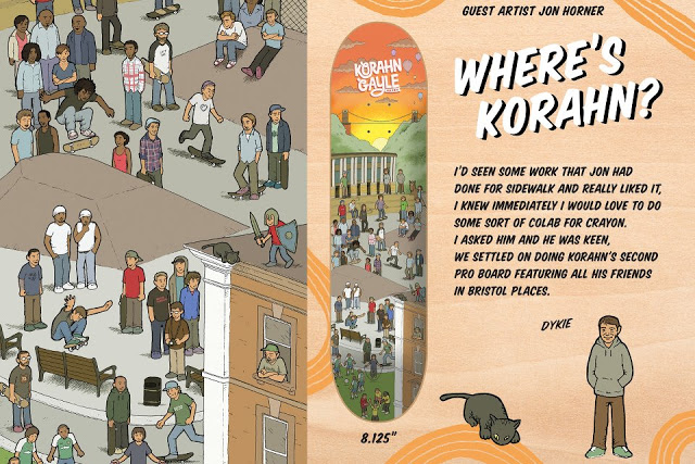
Was the Crayon board pre-Predatory Bird? How did that come about? Did you skate the board yourself?
That
was a direct result of the 'Where's Chin' poster. Dykie sent me an
email and it was his idea to do something similar but with Korahn and
his friends and famous Bristol spots. I was so stoked to be asked,
Korahn is an amazing skater and Crayon have some serious heavy hitters
doing graphics for them, so to even be considered was amazing. I didn't
ever skate one myself, it was a bit wide for me! Having someone make
something you've drawn into a skateboard is the best feeling.
Do you art types all hang out?
Andy
and I have regular important high-level executive business meetings to
discuss implementation strategies for Class IIB. These often take place
at the kerb bit at Clapham skatepark, the crusty old banks at Royal Oak
or in the pub.
You drew up a rad graphic for the new Blueprint. Do you think they should have ditched the spray hearts or do you reckon it's a legacy the new guys should keep up?
I'm
trying my best to get hired by Bizarroprint. No luck so far though.
It's all a bit sad what's happened there, isn't it? Everything I know
about exactly what happened comes from internet rumours and hearsay
(Myleene loves industry gossip), but it seems like the brand's been in a
bit of a tailspin for a little while due to various factors and now
it's crashed down to earth in the Canadian tundra. I suppose it's a good
thing that what Dan Magee and Paul Shier created was seen as worth
saving, but this lumbering dreadlocked Frankenstein's monster is fast
becoming a cruel and incontinent taunt to the past.

In a way, maybe it's exciting that Britain can add a brand to the Blind/World legend of companies that were once great and are now a bit awful, but it must be pretty horrendous for Dan that they've not mixed up the graphics a bit. I mean, aside from the always incredible team, the first thing that Blueprint brings to mind is an aesthetic, and as far as I can tell, that was entirely deliberate and all Dan's doing. It must be pretty grim to see something you've worked so hard at and poured so much of your soul into being hacked up and shuffled about and slapped with a rasta colourway. From the graphics I've seen so far, and particularly that monstrosity of a cruiser board, it's like they've got all the pieces but they don't quite understand how they go together, why they would go together and why anyone would even want them to in the first place. But stick them together they do, with all the artistry of a drunk assembling an Ikea bookshelf.
But maybe
it's a good thing. I think we can now all agree that Blueprint is no
longer worthy of our attention, and perhaps that will give some other UK
companies a bit of breathing space. Now that the Death Star has been
blown up, the ewoks can all dance around a bit. If the decline of
Blueprint was in any way responsible for the birth of the National and
the existence of those RA Brown painting decks then it wasn't an
entirely bad thing.


Triangles in 2013: Post-post-modern, or tired and tedious?
I've got a theory about Palace and it's quite highfalutin (which is just a pretentious way of saying pretentious).
Plato
had a theory that everything has a form. I tried explaining what this
means in my own words but it wasn't working out so I'm going to do some
route one philosophy student work and copy and paste from Encarta:
"Forms
are the essences of various objects: they are that without which a
thing would not be the kind of thing it is. For example, there are
countless tables in the world but the Form of tableness is at the core;
it is the essence of all of them. A Form is an objective 'blueprint' of
perfection."
My theory is that Palace is
incredibly close to the form of 'Palace skateboard company'. It seems
like every single decision that they make is made on the basis of 'is
that what we want to do?'. It sounds obvious, but it's pretty rare that
you don't see something that's been second guessed in some way, whether
it's to try and broaden its appeal and shift more units or to take the
edges off an idiosyncratic idea that might be unpopular or
controversial. It's especially rare in a company that's actually got
popular and successful. There seems to be no great strategy in place at
Palace other than, in the words of Nuit, "Do what thou wilt shall be the
whole of the law" and I think that's pretty admirable.
Having
said all that, they're so tempting to make fun of! As far as I can
tell, there are two main reasons for that. Firstly, they've got a really
strong graphic identity (and rest assured I hate myself for using that
phrase) which makes them easy to parody because it's very
straightforward to make it clear that what you're doing is a Palace
reference. And secondly, they're massively beloved of Sugar Ape readers
who are nature's easiest and most deserving target.
John Rattray bonus!

Jon
sent me, via Gmail, an illustration he did, fully finished and
coloured, of Carl Weather's character Dillon, from Predator. The
illustration depicted Dillon, screaming on his knees on the jungle
floor, his arm, severed at the shoulder is being carried skyward,
assault rifle still blasting, by a bold and ravenous gull.
The accompanying note said, "I've been very much enjoying the blog lately and in a moment of inspiration(?) I drew this. It's yours if you want it."
I did want it. This was the greatest piece of unsolicited mail I've ever received. So far it's a tee shirt.

Not long after that, on Instagram, he posted a picture of some graphic ideas with portraits and quotes from Bertrand Russell, Hunter S. Thompson, George Orwell and Kurt Vonnegut. I hit him up about the fact that these should be somehow manufactured. It's a project that remains unrealised - as lots do - but it showed that we were on the same page as far as heroes go.
Anyway, a couple of weeks after that there was some news coverage of Dutch artist Bart Jansen's taxidermied cat helicopter. Jon posted a picture of that and I commented that "I just can't tell if I really do like that or not", I've still never double tapped that image. Jon replied, "I know what you mean. It's the expression on his face that sways it for me. Plus, he was named after one of the Wright brothers. And it would be really fun to take it to Trafalgar Square and blow some pigeons minds." He was selling me on the idea that although morbid, it was also awesome. I already knew morbid things can be awesome from growing up watching Evil Dead and listening to the drum check with Pete Sandoval skit. I told Jon that "it certainly adds a new dimension to the whole predatory bird thing". That's when he suggested, "The villain in The Predatory Bird comic would fly around in this".
"You make it and I'll sell it and this time next year we'll be millionaires!" I said. I've never been sure if he got the Only Fools and Horses reference there but he did agree that "Unimaginable riches surely beckon".
That's pretty much it. We've been collaborating on this comic story since then. We email and occasionally Skype to talk about it. It's been a lot of fun, Thrasher's been running it and hopefully we'll adapt it into a little stand alone thing at some point.
Andy Smoke Bonus!
Jon and his pal Andy Smoke are both managing directors of the UK's leading skateboard sticker company, Class IIB. Dismantling the snobbery of the skateboard industry one adhesive at a time, their limited edition collaborative cartoons can be admired (and purchased) here: http://class2b.bigcartel.com/ You might have seen Andy's drawings illustrating our Bite My Wire music page, you might remember the board graphic he did for rooftop-preacher and self-confessed sexual superhero Jereme Rogers, or you might even have noticed the excellent drawing of Jon he knocked out to illustrate this very interview; so we asked Andy about his mate. Andy's drawings, photographs, mixes and other art can be found here.

How do you know Jon?
I met Jon through a mutual affection for Clockwork Orange banks and the Beano. I think Class 2B was born out of skating the bottom step of Southbank 7 one day. And anyway, having drawings printed up into stickers rules!
Congratulations on getting a drawing on a Jereme Rogers board.
The Selfish graphic competition was funny - the other entrants were excellent. I'm still amazed the boards ever saw the light of day. J Cass may be manically insane, but he put one of my drawings on a board. Stoked!
How did you get into drawing?
Alex Moul was getting a lot of coverage in the first magazines I bought. Moul was on Deathbox then - a company that inspired not only with their skaters, but with their twisted cartoon graphics. New Deal and World were also making great graphics - I'm still stoked on Marc McKee and Sean Cliver's art. Needless to say, I was hooked.
And how do you go about it?
Most of my stuff starts with an idea in the bath, followed by a damp paper sketch. Sometimes drawings get completely re-worked in Photoshop; other times they get inked and coloured by hand.
No comments:
Post a Comment